RECENT POSTS


01.March.2023
eLuxury Blog: eLuxury Mattress Pads Meet Flammability Standards without Flame Retardant Chemicals
0 Comments
How to Influence Mood & Behavior with Room Color
How Wall Colors Affect Behavior
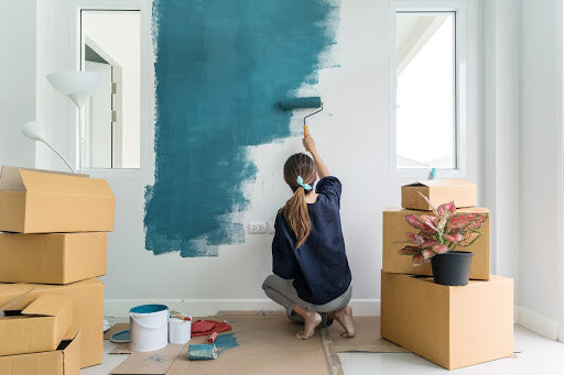
Choosing the right color scheme when decorating doesn’t need to be complicated. The room should reflect elements of your personality, color preferences, and desired mood. Since decorating trends are constantly changing, it is important to create a timeless and personal theme that will make you and your family feel happy, calm, energized, confident, relaxed, and productive. You can decide what mood or energy is present in each room by learning how color affects the brain and using that knowledge to create your ideal space.
With color psychology, specific colors have been linked to causing or enhancing certain emotions. For example, when a person wears white clothing, we often associate it with purity, which is why it is common for wedding dresses. You may also relate blue to sadness, green to envy, or yellow to happiness. However, when it comes to room color meanings, colors can convey so much more.
Red
Using red as the main color in a room can be intense if it is too bright or there is too much of it. Red can increase heart rate, adrenaline, and blood pressure. However, it can also increase energy levels, confidence, and feelings of love or empowerment. Red is a great color for a front door or entryway because it makes a bold first impression. It is also great in rooms where you spend the most time after dark, where it creates an ambiance of warmth and intimacy. Because of its energizing and sometimes aggressive nature, it is not usually a great color for bedrooms.

Orange
Orange is a friendly and youthful color, great for children’s bedrooms. It causes feelings of confidence and encourages social interaction, independence, and cooperation. It is also ideal for exercise rooms because it adds to excitement, energy, and enthusiasm.
Yellow
In moderation, yellow makes us feel happy and full of positive energy. Its soft warmth reminds us of sunshine and can open up a small space and make it feel more light and airy. It even aids in memory and concentration. However, darker or brighter shades in large amounts can actually contribute to feelings of anxiety and agitation, so it is best in small areas like bathrooms, or as accent colors in kitchens and living spaces.
Green
With green, you really can’t go wrong. It combines the cheerfulness of yellow with the calmness of blue for an overall feeling of relaxation and stress reduction. It has a soothing impact on children and promotes togetherness and comfort. If you don’t love green enough to use a lot of it, adding houseplants and green accents are a great way to incorporate these elements. You can also try shades of turquoise for a similar effect.
Blue
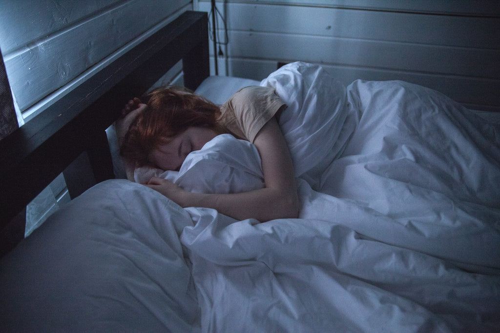
Although blue is sometimes associated with sadness, it can be a great color for home decor, especially in the bedrooms. Darker shades of blue often bring sad feelings, but lighter and brighter shades have a calming effect. Blue lowers heart rates and feelings of anger or aggression, and is particularly effective in children’s rooms, where it can help to minimize tantrums. It can also help create a spa-like atmosphere when used in bathrooms.

Purple
Dark purple is often associated with royalty because it can make us feel regal, elegant, ambitious, and sophisticated. It is also tied to empathy, wisdom, and creativity, which makes it great for kids’ spaces, but if your child is overly sensitive, you may want to go a different direction. Lighter shades of purple have calming effects similar to blue, but with an added warmth, and are also great for bedrooms and bathrooms.
Pink
Pink is often tied to femininity, but is great for both genders and adds to feelings of calm and peacefulness. It is easy to go overboard with pink though, so try to avoid using it as a base color. Start small and add accents until it feels just right.
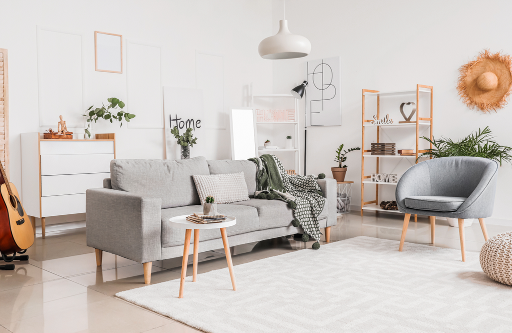
White, Black, Grey, and Brown
These colors are generally referred to as neutral, and can be used to create a base color or to add contrast or emphasis. White and light grey can make a room feel larger, lighter, and more open, and are also calming. Cream, tan, or light brown can have a similar effect, but with more warmth. Darker shades of brown are warm, rustic, and inviting, but too much can be overpowering or make a room feel cluttered. Black is a fantastic way to add contrast, depth, emphasis, and elegance. But again, if you use too much, it quickly takes over the space with a negative energy.

Balance
The key is to find the things you enjoy and make them work together. Now that you know more about color psychology, you can balance room color meanings with the personalities of your family members to create the desired energy.
You can also use contrasting colors or varying hues for added dimension. For example, use a stark white for door frames and baseboards to complement a beige, tan, or grey wall color. Or paint the ceiling white or a lighter shade of the wall color to make the room feel taller.
eLuxury
Once you have chosen the colors you want to use in each room, check out eLuxury for bedroom and bathroom essentials. Visit our eLuxury blog for more tips on choosing the perfect color scheme for your child’s room.